UDEMY REDESIGN
Udemy Personal Plan

SettingIn its capacity as one of the leading online course platforms, Udemy offers a vast assortment of learning options— yet faces challenges sustaining consistent user engagement and ensuring course finalization. As a Product Designer, I proposed a conceptual resolution aimed at lowering the burden of choice and automating daily lessons, akin to conventional in-person schooling, albeit within the cozy environment of one's dwelling.
Timeline
From explorations to final designs in 5 weeks while working with multiple projects at the same time
Why a Personal
Project?
As a budding designer, I took online courses to hone the fundamentals. However, the course structure made me feel unaccomplished unless I finished an entire section daily, leading to burnout from studying for long hours.
I gave myself 10 weeks to design a few feature, while mimicking Udemy design guidelines, to address the long standing retention issue. Simulating the internship experience.
DISCOVERY RESEARCH
Platform’s emphasize courses
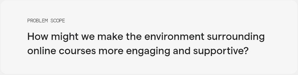
Most platforms put an emphasis on course search-ability, credibility, and outcomes to allow learners to find quality courses that fit their interests. I wanted to focus on the environment courses are taken in and understand how to create an ideal online learning environment.
Testing & Optimization
Conducted rigorous testing across various devices and platforms to ensure compatibility and performance. Gathered user feedback through beta testing and iteratively optimized the app based on usability metrics and user satisfaction.
Completion
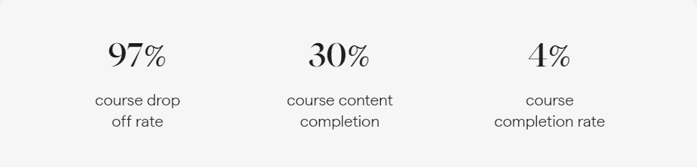
Understand what makes users/students drop of the current course.
Consistency
Quantify what is blocking students from consistently learning and building a habit.

In the beginning, motivation was high. However, students struggled to stay motivated as they dug deeper into a course. This problem lead to students dropping off as the course seemed endless and troublesome. Below are specifics gathered from users.
Decision fatigue/ boredom
Difficulty managing long courses and lack of necessity to know the entire course which causes the student to lose enjoyment and generally procrastinate learning.
Time management
Most students that take courses carry many greater responsibilities. Students had challenges maintaining motivation and managing their time effectively to stay on track.
Community support
Students often struggled to fully understand content and appreciated the value of learning communities (Discord and Slack) to provide instructional and emotional support.

Udemy’s current attempt
Product Goal:
Seamless and flexible experience for all
Looking at the iterative process
Design Iteration
Learning Time
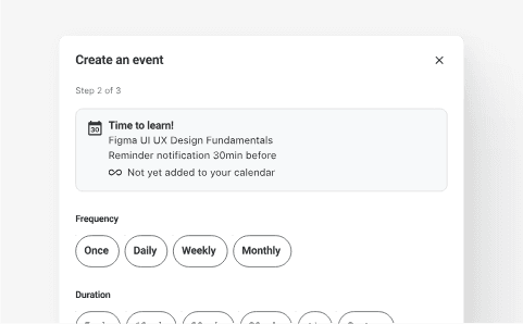
Udemy recognized the low retention rates of it’s courses and implemented features to promote habit building. I think that these features are a good start, but there is room for improvement.
While blocking a time and duration to learn can be useful, the feature doesn’t integrate into Udemy and doesn’t account for individuals who don’t organize their day down to the hour.
I wanted to help create an environment where online courses can be taught to meet a students specific desires without feeling overwhelming. To where online learning is so seamless that students choose to learn even when life gets busy.
By refining my layout, my attention was fixed on delivering essential details while preserving comprehension and heightening adaptability for the user. Here are several studies on diverse components.

Streak Tracker
Users didn’t find much benefit from tracking weekly watch time. It wasn’t particularly motivating nor did it help them build consistency.
Home interface explorations
Personal Plan interface consists of two elements. A prominent window displaying course name, work and progress and a goal window documenting daily and weekly consistency.
Course Work View
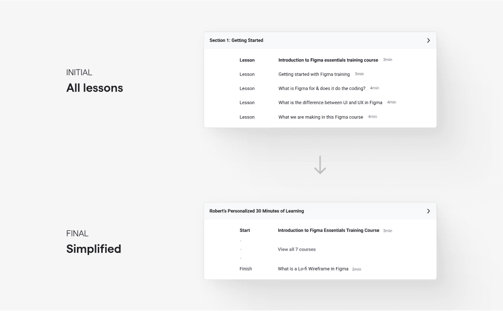
At first, I designed the window to display all the lessons the student needed to accomplish. However I realized that the information displayed was overwhelming and students valued the number of courses rather than knowing each course name. I modified the design to be easily legible containing only the start → end and the number of courses.

Goal Window View
Implementation explorations
On course signup
I wanted Personal Plan to have minimal development to market time, so I had initially planned to implement their existing streak window. However, I wanted the card to convey more information regarding weekly progress. Therefore I designed a dedicated goal window to properly convey short-term and long-term consistency.
Incentivizing users to try a Personal Plan is one of the most crucial steps. I wanted to maximize visibility without sacrificing flexibility. Below are some iterations that I went through.
While it increased visibility, it lacked flexibility even with an option to ignore the Personal Plan. It makes finding the ideal course more troublesome which is not my intention.
The Learning Tools Tab
Compared to forcing the user to interact with Personal Plan, this option is much more flexible, but it lacks visibility. This solution is much less intrusive and could still be implemented as a secondary entry point.
Popup after finishing introduction
Adapting to a short timeline
Looking back on the journey
User Satisfaction
CONSTRAINTS & RESULTS
CONSTRAINTS & RESULTS
ⓒ 2024 SAKShi Singh
Using a popup allowed me to gently present the feature at the right time. I choose to present the feature after the user finishes the introduction section to give the user plenty of time to determine the course’s fit. It also introduces the feature when the user is motivated and will therefore enable a higher engagement rate. This option maximized visibility and flexibility and therefore became the primary entry point.
Due to the project having a short timeline, I was unable to build a functioning product to perform a long term usability study. Instead I allowed users to give me their honest opinion on the functionality while backing the longterm success with psychology.
12/12 users believed that Personal Plan would increase their motivation to learn and help them stay on track. Many users reported that they already instinctually blocked off time to learn.
Any accomplishment, no matter how small, releases the neurotransmitter dopamine which boosts your mood, motivation and attention. It also signals you to keep doing the activity again and again.
Designing the feature to be impactful is a task in it self, but we also need to consider how the feature fits in the existing platform.
Design a perfect experience for one user and then scale something close to other users and the users themselves will help uncover edge cases.
As a product designer, we are often told to prioritize user needs. While this is true, we cannot forget about how design decisions can impact the health and longevity of the business.
The brain closely monitors the body's energy during prolonged decision-making. When energy is low, the brain conserves by limiting functions, including the prefrontal cortex responsible for complex decisions. This can lead to irrational behaviors, poor choices, and quitting prematurely. Thus, it's not just a bad attitude that can hinder goal achievement, but also our brain's energy-conserving responses.
Short term goals increase motivation
Designing a feature for a established platform is challenging
Uncovering edge cases
Finding balance between business and user needs
Reducing decision-making boosts mood
User Satisfaction
12/12 users believed that Personal Plan would increase their motivation to learn and help them stay on track. Many users reported that they already instinctually blocked off time to learn.