TAXATION PLATFORM
Simplifying taxes: Deciphering User Needs and Triggering the Redesign Journey
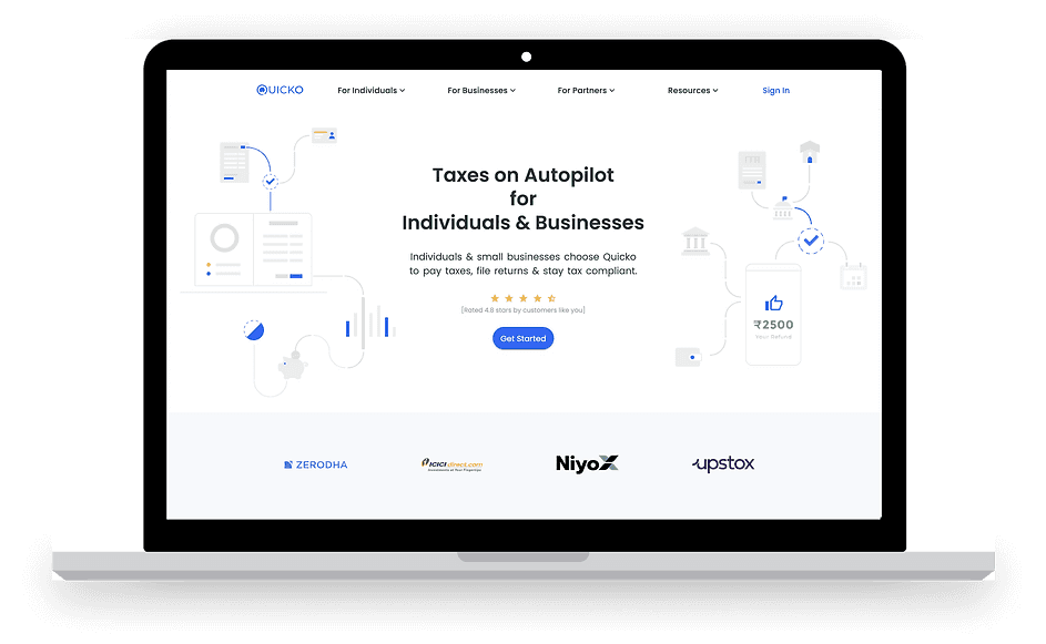
Quicko serves as a gateway to their cutting-edge services, which aims to simplify the tax filing process for both individuals and small businesses in India. With a focus on Software as a Service (SaaS), Quicko provides a platform that empowers users to efficiently manage their tax obligations. The company's commitment to enhancing accessibility and usability in the often complex world of taxes makes it a valuable resource for individuals and businesses seeking efficient, user-friendly tax solutions.
The user category and primary user persona represent a broad spectrum of individuals: every tax-paying citizen of India. The user persona encompasses a diverse range of taxpayers, including individuals with various income sources, salaried employees, self-employed professionals, and small business owners.
The primary user persona, therefore, embodies the average Indian taxpayer, someone who seeks simplicity and clarity in their tax-filing process, and expects a digital platform that streamlines the otherwise complex task of submitting their income tax returns.
Filing taxes in India involves a multi-step process that typically includes calculating and consolidating various income sources, adding applicable deductions and tax credits, meticulously reviewing all tax-related documents, and ultimately submitting the completed return to the Income Tax Department. This comprehensive procedure ensures compliance with the country's tax regulations and the accurate declaration of financial information.
Before I delve deep into the case study, it's important to visual these steps to file Income Tax Return(ITR).

Understanding the Problem Space

The existing product, initially launched had fulfilled its foundational purpose. However, with time and user feedback, it became apparent that the product had accrued what we commonly refer to as "design and engineering debt." This debt comprises various aspects, including user experience challenges, navigation complexities, and the absence of a cohesive design language.
Discoverability
There was no primary button to tax planning application and input fields have very less discoverability which makes it difficult for users to make cognitive decisions.

Lack of Visual Hierarchy
From the testing sessions, it was clear that the user was confused at multiple points to understand the product’s functionality. There were many parts of the application that lacked hierarchy visual wise and information wise, which makes it difficult for the users to understand and complete the form.


Navigation
The product’s information architecture was ambiguous and a few duplicities in the functionalities, which made it challenging for the users to navigate within the application and the possibility of losing context through the process.
Scalability
The product's scope expanded significantly as stakeholders made the strategic decision to venture into tax planning. This expansion necessitated a comprehensive reconstruction of the product to seamlessly integrate both tax filing and planning functionalities.
USER PAIN POINTS
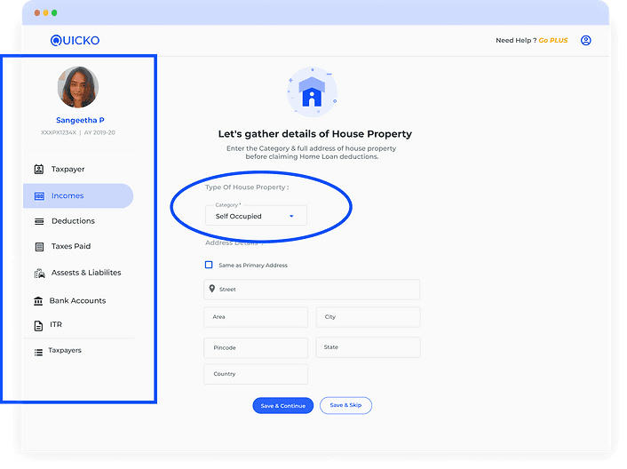
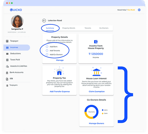
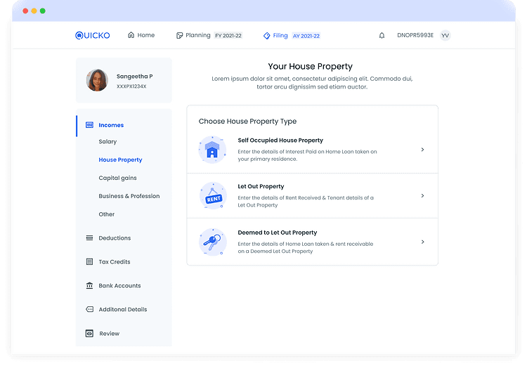
On this screen, the user is within the "House Property" subcategory under "Incomes." However, the interface does not clearly convey the presence of five subcategories within the income section. This lack of clarity makes it challenging for users to navigate seamlessly between different income subcategories, leading to confusion and contributing to user drop-off issues.

Mandatory actions that allow the user to complete the task are not highlighted, leading to errors at the end of the filing process. This was one of the major reasons for user drop-offs.
Displaying non-mandatory action cards with equal prominence as mandatory ones creates a visual inconsistency that detracts from the user experience.
The presence of illustrations on this screen introduces visual noise and detracts from the clarity of the primary Call-to-Action. Additionally, the card design used throughout the application does not effectively align with the user's specific intention, which, in this case, is to select the house property type in order to add income details. The design fails to communicate the necessary action to the user.

The experience a person has while using a product or service. It includes the stages a user goes through from discovering a product to making a purchase decision.
There are many layers and emotions connected to this. The following shows the user journey of the user throughout the application.
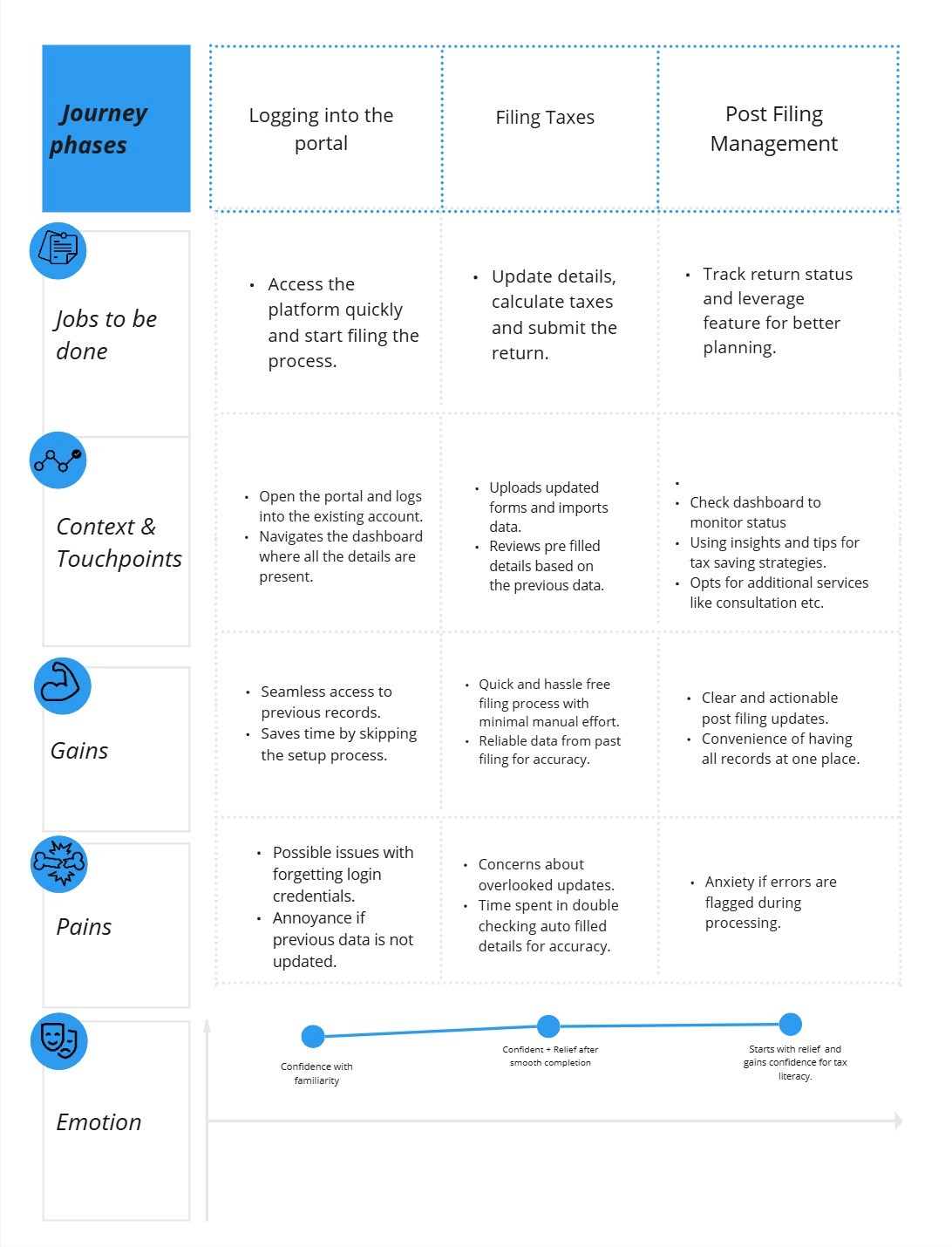
USER JOURNEY
Redesign Goals
Make it simple, but significant

FINAL SHIPPED DESIGN


BEFORE
AFTER
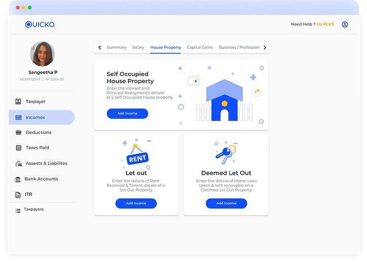
The side navigation now has an expandable menu that allows the user to know which part of incomes they are on, this also gives the overall summary of the income section.
Options on the form are pre-filled and displayed in the first glance, which makes it easier for the user to choose and complete the task.

#3
All of the categories are shown with equal prominence here to assist the user to make an informed and timely selection.
AFTER
BEFORE
LET'S TALK NUMBERS - IMPACT
After the redesign of these data-intensive layouts, the filing rates for this financial year(2021-22) went up 3 times. Below is the data on the number of returns filed through the product without the help of tax experts (users filing on their own).

24,072
No. of returns filed for 2021-22
7,934
No. of returns filed for 2020-21
CHALLENGES & LEARNINGS
Since I have no background in fintech, it was quite challenging to learn all about taxes and how they are filed.
It was interesting to understand the business needs and targets after connecting with the stakeholder.
Gaining a deep understanding of user behavior and closely tracking their patterns provided valuable insights, enabling me to align our objectives effectively.
I understood that it is critical to be a team player in order to maintain active communication with diverse teams in order to obtain and comprehend data.
Adapt, implement design cues after feedback sessions and keep testing to best understand your users.


